4 pieces of art + my uncalled for opinions
Bad – Don’t like it
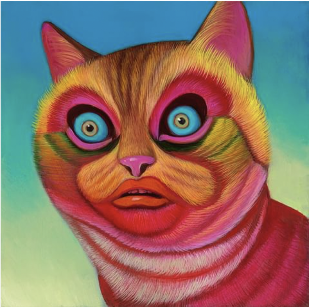
Just look at it! It is a little disturbing, and I think that is the point. I think the colors clash a bit and no thank you to the eyes. I mean, te each of their own, but I do not enjoy this piece of art.
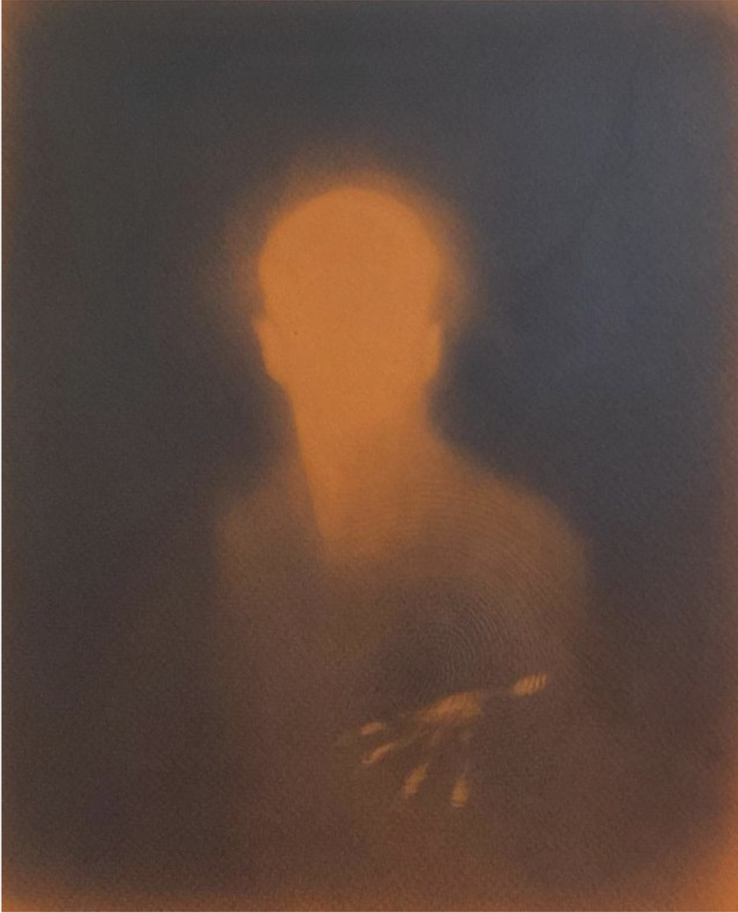
Good – Don’t like it
This piece of art is objectively good, the shading is nice and, as someone who can’t draw hands, that hand is impressive. But I don’t like it. The hand is creepy and the nails. Nope. No thank you. I am out of here.
Bad – Do like it
I like this one. It is pretty and the hand is quite impressive. But it is kind of boring. I think it would be better with a more drastic color pallet.
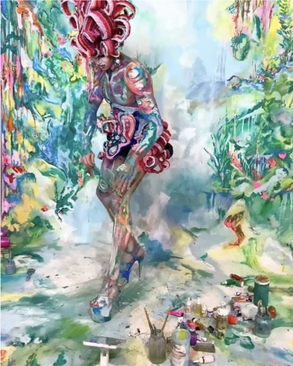
Good – Like it
This piece of art is nuts and I like it. The colors are pastel-ish and I like how it is not too bright, but still colorful. I like the chaos of it but the colors are more subdued and the nuttyness ties together to make it nuts, but kind of calming. It kind of reminds me of some of Claude Monet’s paintings. Maybe because of the colors and the flowy nature of it? I don’t know but I like it.