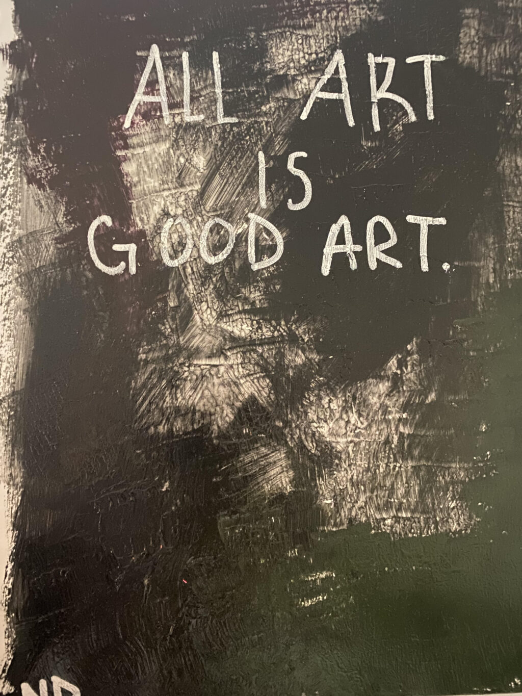
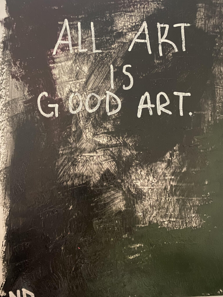
Bad Art #1 – I don’t like the colors of this piece, I also think that the shapes and highlights are weirdly uneven. Along with that, under some of the yellow shapes, you can see where I wrote “y” to tell myself to paint it yellow. I think that if I painted this in colors I actually like instead of bad colors, it would improve the painting a lot. If I erased the pencil before painting over it I believe it would improve the art, too. Overall, I don’t think it’s necessarily a bad piece of art, but it definitely isn’t good.Bad Art #2 – This is literally so ugly to me. The colors blend in with each other rather than complimenting or standing out, the writing is also very uneven and weird. I used glue instead of white paint (don’t ask me how I managed to do that). If the colors either blended better or were different, and if the writing was more contained and pretty then I do believe I would really like this piece, but they aren’t, so I don’t.
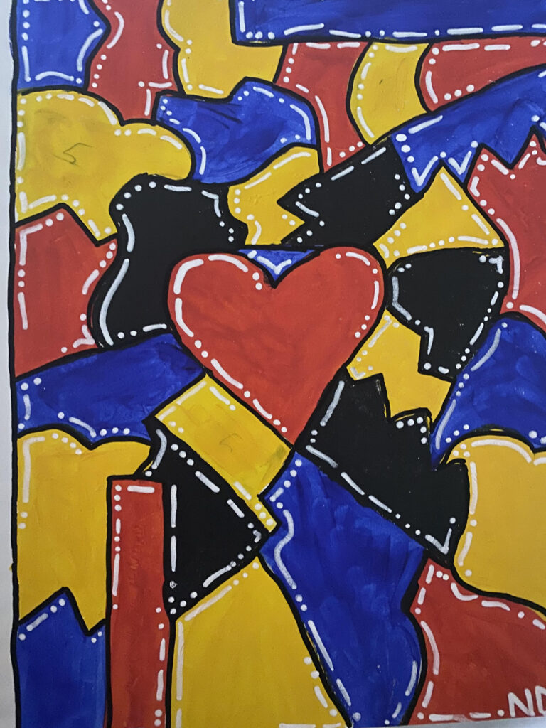
An Argument for Piece #1 To Be Good:
The colors on this piece contrast really well, and I think that the abstractness of the highlights and shapes really pulls this piece together. I like the heart in the middle, and I feel like it signifies something really beautiful if you think about it a lot.
What’s Good and What’s Bad:
Good:
Colors that either contrast or work well together
Art that tells a story/shows meaning in some way
Art that can be messy, but still organized.
Bad:
Colors that look bad together,
Pieces that have no real meaning and that are just random