Bad Art
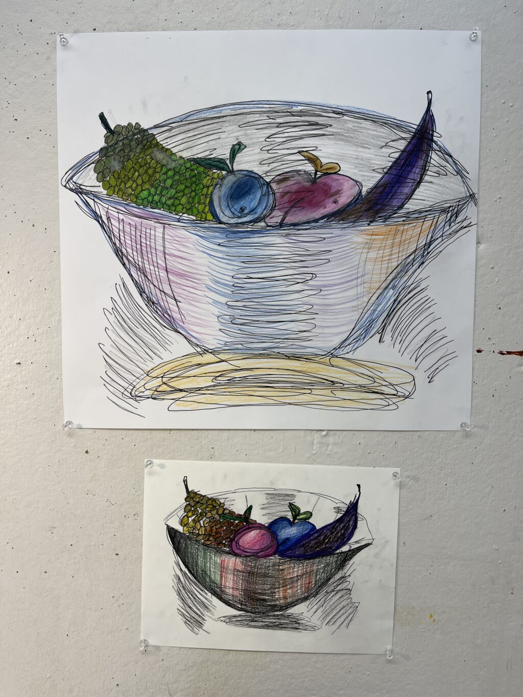

The qualities that these two works share are the unblended shadows and incorrect colors for the various fruits. The colors are also random and are in blocks rather than naturally blended. What makes these works bad is the fact that the shapes and lines are not cohesive and the shadows and highlights are either backwards or don’t exist at all. Overall, these pieces, at least in my opinion, are not pleasant to look at because of the rotten fruit with the bugs and mold on it. What would make these pieces good is if there was more dimension to the pieces of fruit. If they had appropriate shadows and colors, they would actually resemble reality. Also, if the lines that make up the shape of the bowls were blended and the shadows surrounding the bowl were blended, it would also look more soft and realistic. If I were to defend a piece for being good, it would be the smaller one. It is very close to looking like something that had much effort put into it and almost looks like a successful abstract piece. The criteria that I use for determining whether art is good or bad is whether or not I would want to look at this piece a lot and gain joy and a good feeling from doing so. It does not necessarily have to look real, it can be abstract. It just has to be visually appealing and comfortable to look at for it to be good, in my opinion. What this work says about me is that I like to be a detailed artist. These works of mine are flat, and there is not very much careful detail in each component. The artist that I want to be puts much detail and meaning into her pieces, which is not reflected in these “bad art” pieces.